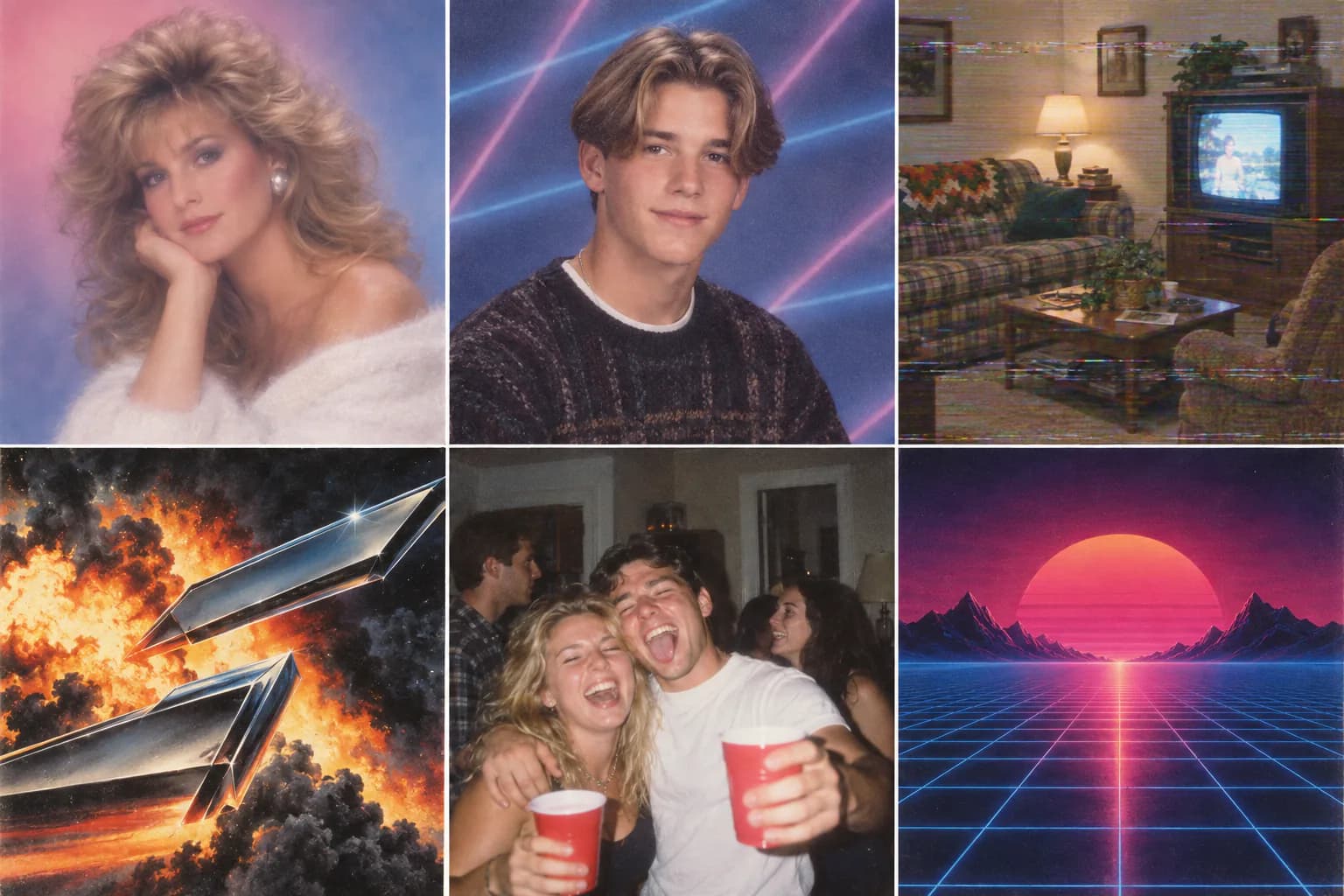
Somewhere around the point where everyone's social feed filled up with the same soft-focus mall portrait, retro prompting stopped being a novelty and became a genre. The 1980s and 1990s looks were the ones that travelled furthest, and they travelled because they are unusually easy to verify: everybody knows what a yearbook photo looks like, so everybody can tell instantly whether yours is right.
That is also why most of them fail. The era is not a filter. A convincing 1994 photograph is the product of a specific film stock, a specific flash, a specific backdrop that a specific company sold to schools — and if you ask only for "90s style" you get a modern photograph wearing a costume. Below are eighteen prompts that name those specifics, each with the reasoning behind it so you can build your own rather than only borrow mine.
What actually makes a retro prompt work
Five levers do nearly all the work. Almost every prompt in this article is some combination of them, and once you can see them you can construct any era you like.
- The capture medium. The highest-value phrase in any retro prompt. "Shot on Kodak Gold 200" carries grain, warmth, contrast and highlight response in four words. "Recorded on VHS" carries scan lines, chroma bleed and a resolution ceiling. Name the medium and half the era arrives for free.
- The lighting. Eras have signature lighting. A 1990s disposable camera means hard on-camera flash with a black falloff behind the subject. A 1980s studio portrait means a soft key with a separate hair light. Describe the fixtures, not the mood.
- Wardrobe, hair and set. The part people already write well — and the part that matters least if the first two are missing.
- The defects. Grain, dust, halation, light leaks, misregistration, tracking lines. Period images are full of them and clean digital renders have none, which is the single biggest giveaway.
- The aspect ratio. 4:3 for anything that lived on a television or a tape. 3:2 for 35mm photography. 1:1 for record and CD sleeves. 4:5 for a portrait print. Get this wrong and the image reads as modern before anyone has looked at the content.
Everywhere below, [SUBJECT] means either a description of a person or — better — an attached reference photograph. More on that further down.
The 1980s prompts
1. The mall glamour shot
A studio portrait of [SUBJECT] in the style of a 1987 American shopping-mall glamour photography studio. Soft-focus diffusion filter over the lens, heavily feathered and back-combed hair, blue eyeshadow and frosted lipstick, an oversized sequinned off-the-shoulder top. Lit with a large softbox key at 45 degrees, a strong hair light from behind and above, and a pastel pink-to-blue airbrushed gradient backdrop. Shot on Kodak Gold 200, 85mm lens at f/2.8, gentle halation blooming around the highlights, visible film grain. 3:2 aspect ratio.Why it works: three phrases carry it — the diffusion filter, the hair light, and the airbrushed gradient backdrop. That combination is the Glamour Shots house style, and no amount of "80s aesthetic" substitutes for it. The halation is what makes the soft focus look optical rather than like a blur applied afterwards.
Swap this: replace the gradient with "a starfield backdrop" or "a soft-focus woodland print" — both were standard options in the same studios, and both read instantly as the same year.
2. The action movie one-sheet
A 1985 theatrical action-movie poster with [SUBJECT] as the lead. Low-angle hero shot, arms folded, backlit by an orange fireball, helicopter silhouettes in a bruised sky. Hand-airbrushed poster illustration, painted — not photographic. Heavy chiaroscuro with a warm rim light along the jaw and shoulders. Bold condensed sans-serif title across the lower third with a chrome bevel and hard drop shadow. One-sheet proportions, 27x40.Why it works: "painted — not photographic" is the whole prompt. Without it you get a modern composite with lens blur and colour grading. With it you get the airbrushed illustration that every poster of the period actually was.
Swap this: make it a buddy picture — "two leads standing back to back, one grinning, one grim" — which is its own instantly readable sub-genre.
3. The late-80s anime cel
A single frame from a 1988 Japanese OVA. [SUBJECT] drawn in late-1980s anime style: angular chin, large eyes with three-point catchlights, feathered hair with varying line weight. Hand-painted cel over a painted background, slight registration misalignment between cel and background layers, dust and fine scratches from the film transfer. Muted period palette of desaturated teal, mustard and maroon. Dramatic side key with a hard cast shadow across half the face. 4:3 aspect ratio.Why it works: "hand-painted cel" plus "registration misalignment" is what separates 1988 from a modern digital drawing imitating it. The palette instruction matters too — period cel paint simply could not hit the saturation that digital colour does.
Swap this: change the year to 1996 and ask for "flatter colour and heavier outlines" to jump from film-era OVA to television-era animation.
4. Arcade game box art
Video game box art from 1984 for a fictional arcade title starring [SUBJECT]. Airbrushed science-fiction illustration with an exaggerated dynamic composition bearing little relation to actual gameplay. Neon grid horizon, chrome lettering with a magenta-to-cyan gradient, dense starfield. Painted in the style of early-1980s arcade marquee art. A small screenshot inset in the lower corner showing blocky 8-bit pixel graphics. Slight print misregistration and a visible halftone dot pattern. 4:3.Why it works: "bearing little relation to actual gameplay" is a genuine historical detail, and asking for it produces the overwrought composition these boxes always had. The halftone and misregistration are what make it read as printed cardboard rather than a screen.
5. The synth-pop sleeve
A 1983 synth-pop album cover featuring [SUBJECT]. Portrait lit with magenta and cyan gels and a hard rim light, dry-ice haze catching the beams, a chrome wireframe grid receding toward a setting sun. Skinny tie, pastel blazer with the sleeves pushed up. Shot on Ektachrome slide film — high contrast, dense blacks, saturated primaries — with a slight anamorphic flare. Album title in a thin geometric sans with wide letter-spacing, upper left. 1:1, with the soft corner wear of a record sleeve.Why it works: gel lighting and slide film are doing the colour. Modern lighting described as "neon" tends to render as flat LED wash; gels plus Ektachrome give you the deep, slightly crushed saturation of the period.
6. The aerobics tape
A still from a 1986 home aerobics VHS tape. [SUBJECT] in a high-cut neon leotard over patterned tights, legwarmers and a terry headband, caught mid-grapevine, beaming straight at the camera. Mirrored studio wall with a ballet barre, potted ferns, mauve and teal geometric wall graphics. Shot on broadcast video — soft, with blown-out highlights and the mild horizontal smear of magnetic tape. 4:3. A chunky rounded lower-third caption reading WARM UP.Why it works: specifying video rather than film is the era tell. Broadcast video of the period was softer, flatter and more prone to clipped highlights than film, and asking for film here would produce something that looks like a modern fitness advert.
7. The catalogue family portrait
A 1989 department-store catalogue family portrait. [SUBJECTS] arranged in a stacked triangular pose, coordinated denim and cream knitwear, everyone smiling directly into the lens. Mottled blue-grey painted canvas studio backdrop. Flat even lighting from a large softbox with a fill card, almost no shadow. Shot on Kodak Portra 160 in medium format 6x7 — very sharp, slightly warm. Faint paper texture and the dot pattern of catalogue printing.Why it works: the mottled canvas backdrop, the shadowless lighting and the stacked triangular pose are the three constants of this format. Medium format is what gives it that slightly unnatural sharpness.
8. The sci-fi paperback cover
A 1982 mass-market science-fiction paperback cover. [SUBJECT] as the protagonist in the foreground, three-quarter turned and looking off-frame, a ringed planet and a chrome starship behind them. Airbrushed acrylic illustration in the style of early-1980s paperback art — smooth gradients, high-gloss chrome, a starfield with four-point flares. Warm key from the planet's glow, cool fill from the left. Slight ink misregistration and the faint tooth of uncoated pulp paper. Tall paperback proportions, 2:3, with a narrow spine shadow down the left edge.Why it works: "airbrushed acrylic" and "uncoated pulp paper" are the two phrases separating a period paperback from a modern digital illustration. The flares and the gloss are period rendering conventions, not lens effects, which is why asking for a painting rather than a photograph matters here.
Swap this: ask for "a fantasy paperback, 1979" and you get the other half of the same shelf — muted earth palette, hand-lettered title, no chrome.
9. The music video freeze-frame
A freeze-frame from a 1985 music video. [SUBJECT] mid-performance behind a microphone, a wind machine lifting their hair, sharp-shouldered jacket with the sleeves pushed up. Hard coloured backlight in magenta and cyan cutting through heavy haze, an out-of-focus neon sign behind. Shot on 16mm film and transferred to video, so there is film grain sitting over scan lines, mild ghosting on movement and slightly blown highlights. 4:3.Why it works: "shot on 16mm and transferred to video" is how these were actually made, and it produces a texture nothing else does — film grain and tape artefacts in the same frame. Asking for either one alone gets you half the look.
The 1990s prompts
10. The yearbook portrait
A 1994 American high-school yearbook portrait of [SUBJECT]. Centre-parted curtain hair, plaid flannel shirt over a plain tee. Purple and blue laser-beam backdrop. Standard three-quarter seated pose, shoulders angled away, chin turned back to the lens. Flat studio lighting with a subtle hair light. Shot on Fujicolor Superia 400 — warm cast, fine grain, slight softness at the frame edges. 4:5 portrait crop with a thin white border.Why it works: the laser backdrop is the single most recognisable object of the decade's portraiture, and the seated three-quarter pose was mandated by the studios that shot these. Name both and the year is unmistakable.
Swap this: move it to 1991 — "larger volumised hair, acid-wash denim jacket, teal and purple geometric backdrop" — and you cross from one half of the decade to the other.
11. The disposable camera flash
A candid photograph taken on a disposable camera at a house party in 1997. [SUBJECT] caught mid-laugh, off-centre, the frame slightly tilted. Harsh direct on-camera flash: blown-out faces, a hard black shadow thrown on the wall behind, red-eye, and everything beyond about two metres falling away into darkness. Cluttered kitchen background, fridge covered in magnets. Shot on Kodak Gold 400 — heavy grain, muddy shadows. Warm orange date stamp in the lower right reading 08 14 97. 3:2.Why it works: the falloff. A fixed flash lights what is close and abandons everything else, and describing that physics explicitly does more for authenticity than any amount of "90s party vibe". The date stamp is short enough that the text usually renders correctly.
12. The sitcom promo shot
A promotional cast photograph for a 1995 network sitcom. [SUBJECTS] crowded onto and around an oversized sofa on a brightly lit multi-camera set, all mid-laugh, one leaning over the sofa back. Warm even three-point studio lighting with no hard shadows anywhere. Set dressed as a New York apartment: exposed brick, mustard armchair, a bicycle propped against the wall. Shot on 35mm for broadcast — saturated, slightly soft. 4:3.Why it works: "multi-camera set" and "no hard shadows anywhere" reproduce the flat, shadowless look that came from lighting a stage for four cameras at once. It is the reason every sitcom of the period looks like every other one.
13. The camcorder freeze-frame
A freeze-frame from a home VHS camcorder tape recorded in 1992. [SUBJECT] filmed handheld in a living room, slightly out of focus, over-exposed by the camera's auto-gain near a bright window. Heavy analogue artefacts: visible scan lines, chroma bleed on reds, tracking distortion across the bottom of the frame, soft ghosting trailing behind movement. Date and time burned into the lower right in blocky white characters, JUN 14 1992 3:42 PM. 4:3, low resolution, washed-out colour.Why it works: chroma bleed and auto-gain are things tape and camcorders genuinely did, and they are rarely in a model's default idea of "retro". The ghosting is what sells it as a frame pulled from motion rather than a still photograph with a filter over it.
14. The hip-hop album cover
A 1996 hip-hop album cover. [SUBJECT] photographed from a low angle in front of a graffiti-covered roller shutter, arms folded, oversized puffer jacket, beanie, layered gold chains. Overcast daylight, slightly cool, deep shadows. Shot on Kodak Portra 400 with a 24mm lens so the perspective stretches at the edges. Artist name across the top in a bold graffiti-inspired blackletter, album title in small caps at the foot. 1:1, with the soft corner wear of a CD booklet.Why it works: the wide lens at a low angle was the house style for these covers, and it changes the subject's proportions in a way that a normal lens cannot fake. Keep the two pieces of text short or set them yourself afterwards.
15. The grunge press photo
A 1993 record-label press photograph of a four-piece grunge band including [SUBJECT]. Standing in a row against a damp brick alley wall, nobody smiling, most looking slightly away from the lens. Thrift-store cardigans, torn jeans, long unwashed hair. Flat grey overcast daylight. Shot on Ilford HP5 black and white film pushed one stop — strong grain, high contrast, crushed blacks. 3:2, thin white print border with a small studio stamp in the corner.Why it works: these photographs really were shot on pushed black-and-white film, and asking for the push gives you the specific coarse grain and blocked-up shadows that a desaturated colour image will never produce.
16. The Polaroid snapshot
An instant photograph taken on a Polaroid 600 camera in 1991. [SUBJECT] photographed indoors at close range, slightly off-centre and unposed. The built-in flash blows out the nearest skin and drops the rest of the room into a warm murk. Characteristic instant-film rendering: low contrast, milky lifted shadows, a heavy warm-yellow cast, soft edges, and faint chemical blotching in one corner. Framed inside the real white Polaroid border with the wide band along the bottom. 1:1 image area.Why it works: "milky lifted shadows" and the warm cast are the actual chemistry of instant film, and they are what most attempts miss — a sharp, contrasty image inside a white border reads as a modern photo in a costume. The wide bottom band is the format's signature and the reason the frame is instantly recognisable.
Swap this: add "a short caption handwritten in blue ballpoint on the bottom band". Three or four words usually render cleanly at that size.
17. The fashion editorial
A 1996 fashion magazine editorial photograph. [SUBJECT] in a minimalist slip dress against a seamless grey paper backdrop, standing square to the camera with a neutral expression and arms at their sides. A single large softbox above and slightly left, deep unfilled shadow beneath the jaw and collarbone, no reflector. Shot on Kodak Portra 400 in medium format — very fine grain, muted desaturated palette, matte blacks that never reach true black. Full-bleed page proportions, 4:5, with the faint dot texture of magazine printing.Why it works: the absence of fill light. Mid-90s editorial used one source and let the shadows go, and adding a reflector — which every modern portrait does — makes an image read as contemporary faster than any wardrobe choice.
18. The infomercial still
A still from a 1998 late-night television infomercial. [SUBJECT] behind a kitchen counter demonstrating a product, over-enthusiastic expression, one hand presenting it to the camera. Bright flat studio lighting with no shadow anywhere in the frame, a teal and purple gradient backdrop, out-of-focus studio-audience seating behind. Shot on broadcast video — soft, over-saturated, clipped highlights. 4:3, with the faint interlacing comb visible on movement.Why it works: shadowless lighting plus over-saturated video is the entire visual language of the format, and it is a look nobody shoots on purpose any more. The interlacing comb is the detail that pins it to tape rather than film.
Getting your own face into them
Every prompt above becomes considerably better with a reference photograph attached instead of a written description of the person. Three things make the difference:
- Use a front-lit, forward-facing reference. Flat even light gives the model the most information about the face. A dramatic portrait fights the lighting you are asking for in the prompt.
- Describe the person as little as possible. When a reference is attached, adjectives about the face compete with it. Let the reference carry the likeness and spend the prompt on the era.
- Hold the wardrobe clause constant. Across a set, keep the clothing sentence identical word for word. Likeness drifts fastest when the description around it changes.
Where to run these prompts
Every prompt here is plain English with no model-specific syntax, so it will run almost anywhere. But three capabilities decide whether a retro look actually lands, and not every tool has all three.
- Reference images for likeness. Putting your own face into a 1994 yearbook portrait needs a model that accepts a reference photograph, not just a written description of a person. Text-only descriptions give you a different stranger every run.
- Batches rather than single images. About one generation in four lands, even with a good prompt. A tool that returns four at once is four times less tedious than one that returns a single image and makes you ask again.
- More than one model. Models differ sharply on exactly the things retro work depends on — how convincingly they hold film grain, whether skin keeps its texture, how well short display text renders. Being able to send the same prompt to two and keep the better result matters more here than in most image work.
Whatever you use, generate four at a time and keep one. The failures are usually obvious at a glance rather than subtly wrong, so culling is fast.
Five things that give away a fake retro photo
- It is too clean. No grain, no dust, no blown highlights, no soft corner. Period images had all four. Name a film stock and ask for grain and minor damage explicitly.
- The face is contemporary. Straight white teeth, poreless skin, modern brows. Ask for "natural skin texture with visible pores, no cosmetic dentistry, period-accurate grooming".
- The aspect ratio is modern. A widescreen 1992 camcorder still is a contradiction. Match the ratio to the medium: 4:3 for television and tape, 3:2 for 35mm, 1:1 for sleeves.
- Something in the frame has not been invented yet. Models leak modern objects into period scenes constantly. Saying what is absent — "no smartphones, no flat-screen televisions, no modern brand logos" — works better than describing what is present.
- The text is gibberish. Long titles and credit blocks do not survive. Keep rendered text to three or four words, or generate clean artwork and set the type over it yourself, which is how the originals were made anyway.
Era cheat sheet
| Look | Medium to name | Aspect | Lighting to describe |
|---|---|---|---|
| Studio portrait, 80s | Kodak Gold 200, soft-focus filter | 3:2 | Softbox key plus hair light, gradient backdrop |
| Catalogue portrait | Portra 160, medium format 6x7 | 3:2 | Flat softbox and fill card, shadowless |
| Poster or box art | Hand-airbrushed illustration | 27x40 or 4:3 | Chiaroscuro with warm rim light |
| Anime cel | Hand-painted cel on painted background | 4:3 | Hard side key with cast shadow |
| Yearbook, 90s | Fujicolor Superia 400 | 4:5 | Flat studio light, subtle hair light |
| Party snapshot | Kodak Gold 400, disposable camera | 3:2 | Direct on-camera flash, hard falloff |
| Camcorder still | VHS tape, broadcast video | 4:3 | Auto-gain over-exposure, available light |
| Band press photo | Ilford HP5 pushed one stop | 3:2 | Flat overcast daylight |
Where to take this next
The eighteen above are starting points, not endpoints. The reusable part is the method: name the medium, name the fixtures, name the defects, match the ratio, and say what should not be in the frame. Change the year and the wardrobe and you can build 1974 or 2003 the same way.
The other thing worth doing is putting them in motion. A 1992 camcorder still is good; the same still with a slow handheld drift and a tape-tracking flicker is better, and short retro video is what travels furthest now.
Which route you take depends on what is in the frame. A portrait — the glamour studio, the yearbook, the band press photo — wants the face animated. A scene wants editing: a slow push in, a tape flicker, a caption, a cut.
For the editing half, Heyperai takes the frames you have chosen straight into a video editor, so it happens without moving files between tools.